What is the mobile compatibility of your menu?
In the digital age, ensuring that your restaurant's menu is mobile-friendly is crucial. With over 60% of digital restaurant orders occurring via mobile devices, it's essential to provide a seamless experience for your customers on their smartphones and tablets This blog post will delve into the importance of mobile compatibility for your menu, discussing best practices for designing a menu that is not only visually appealing but also user-friendly on mobile devices.
The Importance of Mobile Compatibility
Firstly, it's important to understand that your online food menu is the first interaction your guests have with your restaurant online. A well-designed menu can significantly influence a customer's decision to visit or order from your restaurant With the increasing reliance on mobile devices for online activities, ensuring that your menu is mobile-friendly is not just a convenience but a necessity. It shows your commitment to convenience, accessibility, and innovation
Best Practices for Mobile Menu Design
Organize Your Menu for Flow and Interest
Instead of presenting a long, static menu, consider breaking it up into sections that make sense and encourage browsing. Organizing your menu by course, time of day (Brunch, Lunch, Dinner), or listing daily specials in separate, clickable menus can significantly enhance the user experience. This approach not only makes it easier for customers to find what they're looking for but also encourages them to spend more time on your website, increasing the likelihood of them making an order
Implement an Accessible Digital Menu
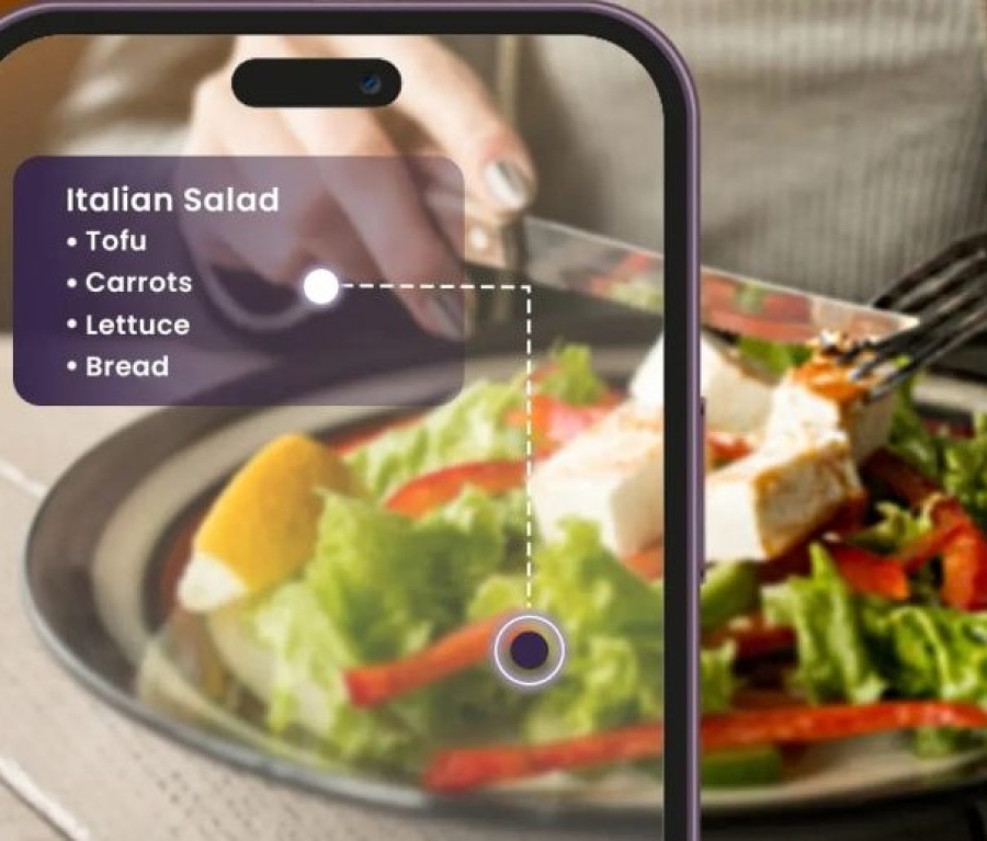
To ensure your menu is accessible on mobile devices, consider implementing an accessible digital menu on your restaurant's mobile website. This can be achieved by using responsive design principles that adjust the layout and content to fit different screen sizes. Additionally, exploring the option of designing a dedicated app for your business can further enhance the mobile experience
Choose the Right Navigation Pattern
The navigation pattern you choose for your mobile menu is crucial. The hamburger menu, for instance, is a popular choice that allows for a larger number of items to be accommodated while saving space. However, it doesn't show the user their current location on the app or website, which can be a drawback On the other hand, a tab bar navigation is ideal for apps with up to 5 top-level navigation options and can easily communicate the current location. It's important to choose a pattern that best suits your menu's needs and your customers' preferences
Consider the Order of Items
The order of items in your navigation matters. Items at the beginning and end of a list are more effective due to cognitive biases such as the serial position effect and the recency effect. Ensure that your most important pages are placed at the beginning of the list to grab the user's attention first
Conclusion
In conclusion, ensuring that your restaurant's menu is mobile-friendly is essential in today's digital landscape. By organizing your menu for flow and interest, implementing an accessible digital menu, choosing the right navigation pattern, and considering the order of items, you can create a menu that is not only visually appealing but also user-friendly on mobile devices. This will not only enhance the customer experience but also increase the likelihood of them making an order, ultimately benefiting your business.


