Choose the best colour combination for your restaurant menu card!
Choosing the right color combination for your restaurant menu card is a strategic decision that can significantly influence customer engagement and sales. Understanding the psychology of colors and how they affect consumer behavior is key to making an informed choice. This blog post will explore the best color palettes for high customer engagement, focusing on the psychology of colors and their impact on food sales.
The Psychology of Colors in Menu Design
Colors play a crucial role in menu design, influencing not only conscious decisions but also subconscious reactions. The colors on a menu can affect what we order, with certain colors evoking specific emotions and associations 1 For instance, green implies freshness, orange stimulates the appetite, yellow catches attention, and red encourages action, often associated with meals with the highest profit margins
Colors that Influence Food Sales
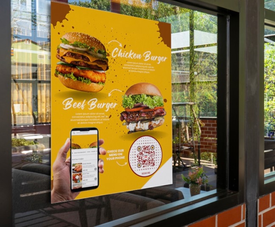
Red and Yellow: These colors are the chief food colors, evoking tastebuds and stimulating the appetite. They are effective at grabbing attention, making them ideal for fast-food industry menus
Orange: A blend of red and yellow, orange is appetizing and has been a trendy color for some time. Its popularity can work for or against your product depending on its context and intent
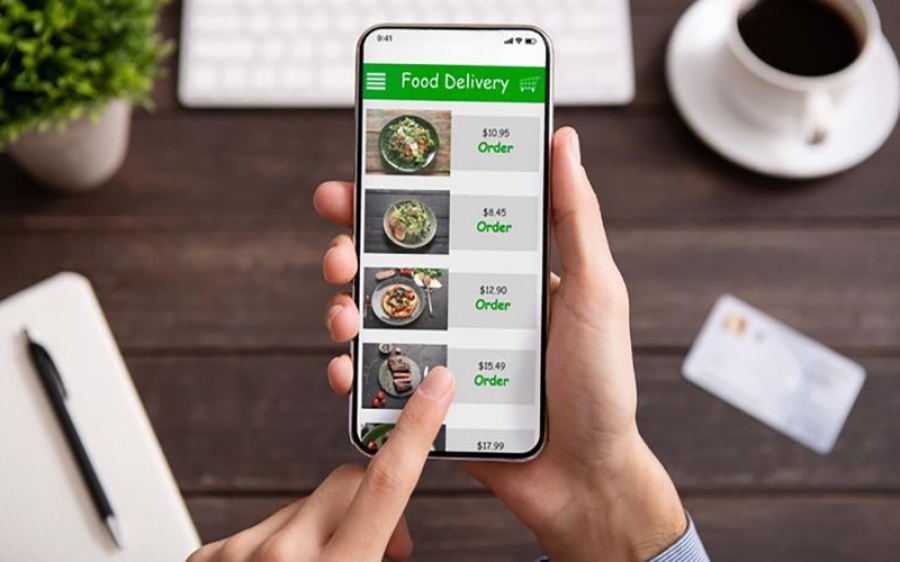
Green: Connotes eco-friendliness and healthiness, but its association with eco products has become more the norm, reducing its impact
Blue and Purple: Cool tones that can be unappetizing if not done correctly. They don't stimulate the appetite as much, requiring careful context and application
White: Connotes cleanliness and purity but can look stark and sterile, necessitating careful use
Choosing the Right Color Scheme for Your Menu
The choice of color scheme for your menu should align with your restaurant's concept, brand, and the experience you want to create for your customers. Here are some considerations based on different restaurant types:
Fast Food: Bright reds and yellows are energetic and stimulate metabolism, suitable for fast turnover
Fast Casual and QSR: The same bright colors are effective, aiming to speed up meal times
Full-Service Dining: Warm reds, oranges, and browns are warm, welcoming, and stimulate appetite, encouraging longer stays
Healthy Menus and Vegetarian Options: Greens and browns are relaxing and calm, associating with nature and health, encouraging healthy choices
Modern and Cool Spaces: Blues and purples suppress appetite and inspire thirst, suitable for bars, lounges, and nightclubs
Conclusion
In conclusion, the best color combination for your restaurant menu card depends on your restaurant's concept, the dining experience you want to create, and the psychological impact you wish to have on your customers. By understanding the psychology of colors and how they influence food sales, you can make strategic choices that not only enhance the visual appeal of your menu but also positively impact customer engagement and sales. Whether you're aiming for a fast-paced dining experience or a more relaxed, health-conscious atmosphere, the right color scheme can make a significant difference in how your customers perceive and interact with your menu.


